Help Us Help WordPress

Email Newsletter
Weekly tips on front-end & UX.
Trusted by 200,000+ folks.
 Register!


 Flexible CMS. Headless & API 1st
This is a personal request from your user, a rallying cry from a compatriot. I personally love WordPress. I make my living from it. The average user, though, couldn’t care less about it. They just want to run their business, tell their family history, organize their church, share their photos or live their life online with a minimum of impedance. In its evolution from simple blogging tool to CMS, framework and software ecosystem, WordPress is losing its way. It needs us to help bring it back and cultivate simple genius.
My agency married WordPress in 2007. We’d been dating for a number of years but were still seeing others: some serious flirtation with Joomla, a blind date with Drupal, a summer romance with CMSMS, even a steady five-year stint with a custom CMS that we lovingly named Rocinante (after Don Quixote’s loyal steed).
We tied the knot with WordPress for one single reason: about six to nine months after most of our projects, we would get the fateful call. “The only person who really understands how to use the website you built just left the company, and we need someone to train us!” It was almost inevitable, except on WordPress. No one ever called for help after a WordPress project except to share their excitement and book the next project. They just figured it out. It was easy and obvious and beautiful. Our clients loved it, and that was something you could grow a business on.
Then, WordPress started to grow up. New features like the menu manager, theme editor and sidebar widgets made WordPress more robust but more complicated. The ecosystem of plugins exploded. WordPress plugins are harder to use than they should be. Ask your users. We did. It was quite illuminating and a hint embarrassing. We decided to act on Tom Ewe’s call to arms and lead by example:
“I find it astonishing that WordPress developers haven’t worked harder to create usability guidelines for plugin development. Even experienced WordPress users are often left guessing as to where they should go to work with a new plugin.One of the key drivers of WordPress’ success has been plugins, and yet they are not actually that easy to use. They appear as being stapled onto WordPress, as opposed to integrating seamlessly. Surely there should be some common usability rules when it comes to plugin development?”
— Tom Ewe
Recommended reading: WordPress Essentials: How To Create A WordPress Plugin
We Lack Conventions, And This Is Why It’s A Problem
Three weeks ago, we brought on Joyce to our customer team at Modern Tribe. She’s smart, she has a real power-user’s/light themer’s grasp of WordPress, and she had never used our free WordPress.org-hosted plugin, The Events Calendar, nor any other of our add-ons. She came back after looking them over and said, “This is far harder to set up than it should be.” I asked her whether she had read the new user primer or the set-up instructions. “No, I didn’t. I bet most of your users don’t either.” I had to admit that Joyce was probably right. Rather than try to list all of the things that she thought might or might not work, she pointed me to Steve Krug’s SxSW talk “Rocket Surgery Made Easy.” I couldn’t turn it off. I’ll boil it down to a few paragraphs for you, but if you develop a plugin or theme or have a product business, this is a must hear.
Krug argues that hiring usability experts is unnecessary (heck, let’s be honest: most of us don’t do it anyway). The real value of a usability test is in getting together (ideally with sushi) and observing the experience, not hearing an expert’s interpretation. Within 15 minutes of watching the first user try to use our plugin, a handful of long-running arguments were resolved and some incredibly simple hurdles were exposed. I’ll walk you through the process that we followed for a remote usability test of The Events Calendar.
Recommended reading: A Process For Professional WordPress Development
Our Remote Usability Test: Step-By-Step
- Total time invested: 6 hours
- Set-up: 1 hour
- Testing: 3.25 hours
- Notes: 0:45 minutes
- Team review: 1 hour
- Find three participants. We had enough users and visitors that a blog post generated about 15 willing offers. We gave away a free copy of The Events Calendar Pro in exchange for participation. Make sure that the criteria for participation are explicit. Krug insists that you really don’t need more than three users, and that turned out to be spot on. By the third user, we were accurately guessing where they would fail. Schedule the test to last about 30 minutes to an hour, depending on the tasks, and give yourself time in between to clean up your notes and deal with other details.
- Think of some process or features you want to explore. We were curious to see how first-time users experience our core Events plugin. With that in mind, we made a series of nine steps that we knew were pretty common for setting up the calendar. Make sure to write them out, and give goal-based instructions, not actual steps. Think, “Create a new event,” rather than “Click the new events menu to make an event.”
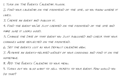
Here are the steps we chose for our usability test to explore the first-time user’s experience. - Set up a domain with WordPress and your plugin or theme on it. If you are testing a plugin, decide whether the problem or feature set that you defined in step 2 is best served by a fairly vanilla build (for example, 2011 theme + minimal plugins + no content) or by a more real-world build (perhaps use your demo content if you have one or a user’s website backup). Configure the whole website precisely for the first step. Run through it once entirely to make sure you haven’t forgotten anything obvious.
- Back up the database of the website so that you can restore between tests.
- Grab a copy of Join.me or your favorite screen-sharing or VoIP tool (such as GoToMeeting or Adobe Connect). We found that Skype just wasn’t stable enough to carry us through the screen-sharing portion of our test run. Join.me functioned amazingly well, except for an issue with voice echo caused by laptop sound cards during one test. The fact that it was free was appealing. Make sure that both screen-sharing and voice are available in whatever set-up you choose and can be recorded together. We used ScreenFlow to record the test so that it could be reviewed later.
- Do a quick test run with someone on your team (or your mom), and make sure that the kinks are worked out.
- Get the whole team ready and present. Do whatever you can to get people to participate. Everyone on our team who participated was blown away by the experience. Buy them fancy snacks or digital beer. Fire up a chat session if your team is remote (one that the test participant is not privy to) so that your team can chat freely. If you are co-located, make sure the team is not in the room where the test is taking place. Twelve people hovering over someone’s shoulder will unnerve even the most confident person.
Discussing the user’s choices and challenges with the developers in real time. - The introduction and set-up are key. Krug has a great script that we just followed. The first key: explain to the participant that the plugin is being tested, not them. There is no wrong or stupid choice. If something is hard or confusing, it’s our fault and we apologize. Secondly, encourage the participant to speak out loud and share their thoughts; i.e. provide a guided monologue. Give them a copy of the steps (paste them into the chat session or email them beforehand), and read them through together once.
- Read a step. Watch. Shut up (bite tongue). The goal is to watch them as if you weren’t there, so don’t help them. This can get crazy awkward, but observing the various choices they make in trying to accomplish a goal becomes very informative. Consistently ask questions to get them to speak out loud, such as “What are you thinking?” and “What did you expect?”
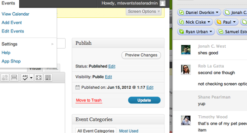
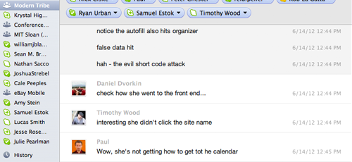
Observing user 2 figure out where to add events to her menu. - Have the moderator and the people observing take notes on what they see, and discuss together.
- Once all of the steps were completed, we asked a bunch of probing questions. We were surprised by how much two users employed the admin bar, so we asked more about that. We were curious why no one clicked the tutorials, despite having the answer in the title. And on and on.
Usability has to do with more than what’s in a plugin’s admin settings. We probed why none of the users took advantage of the tutorials. It turned out that a blog loop has no useful organization, so we made a quick page to group the posts by topic. - Time to pay the participant in money, karma or free goods and get ready for the next test. Reset the website’s database.
- Take some time to condense your notes. Ask everyone who observed to pick the three most important things that can quickly be fixed based on the test. The goal is not to do a redesign; we are looking for quick course corrections. Then we test again in a new cycle.
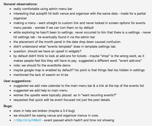
Notes were broken down into observations, user recommendation and bugs.


Findings From Our Tests
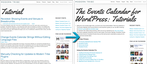
A number of our major debates were instantly answered. For example, we had had a prolonged disagreement about the placement of the menu item for the plugin’s settings. The majority of the development team felt that it belonged in WordPress’ main “Settings” tab because that is a de facto standard. A minority of developers and all of the community team thought that putting it in the submenu for the Events custom post type would be more intuitive.
Recommended reading: Guide To WordPress Coding Standards
Both sides had great arguments. For the test, we put it in the WordPress settings, and then we watched three users in a row fail to find it there in a reasonable timeframe. One found it from the top admin toolbar (we put it there, too), one eventually looked in WordPress’ “Settings,” and one gave up despite looking right at it three times. Standards are great, but we all had to admit that functionality has to supersede a poor standard. We explored putting it in both places, but ultimately we decided to move it to the Events menu for now due to technical limitations.

We also saw how hard a time users had finding the events calendar on the front end of the website, despite it being in five locations. By seeing where people looked for it, we came up with a game plan that took five minutes to implement, and we hope it will make it a whole lot more intuitive.

The usability test was so valuable that Paul, one of the developers, asked if we could do it every month. Usability testing has, without a doubt, provided the best feedback we have ever gotten on our product, it cost very little, and it has now been added to the monthly production schedule. We will be testing these updates next week to see if they truly did improve the experience.
I’m continually amazed by a community’s ability to reach the same conclusion at the same time. Last week, Dave Martin posted for the first time to the core UX team’s blog:
“I’m just getting my feet wet, and quite honestly haven’t a clue where to get started, so I thought I’d set up a quick user test (I’m a big fan of user testing). I set up a temporary WP install, and ran a user from usertesting.com through a couple scenarios.”
Check out the video. It almost hurts to watch her struggle. I can’t tell you how grateful I am to see the core team paying attention as well and engaging quickly. It is a great start.
Call For WordPress Human Interface Guidelines
The average website has over five plugins installed (according to PressTrends) and often a theme options panel. For a great experience to continue throughout the website as people actually experience it, we need to establish strong standards for the rest of the community to follow.
I am calling all WordPress plugin developers and themers. You don’t need to guess what your users might want or how they will experience your product. Just watch them. We know it: if we focus on usability, stability and then value, we can make products that users will line up for.
To the core WordPress team and the community at large: Let’s get together and create WordPress human interface guidelines for those who contribute by providing plugins and themes for the world to use. Apple gave us a rock and upon it built a foundation that few can deny. Google finally got around to it with Ice Cream Sandwich, and I expect to see drastic improvement in the wild west that is the Android application landscape. Help us help WordPress.
In the words of Matt Mullenweg when he saw Dave’s first post:
“Thank you very much for this, I think more frequent and more transparent testing will allow us to make much better informed product and UX decisions. If we do this right we should see the videos get better and better (shorter and less confusion) from release to release.”
Code is poetry. So should be your user’s experience.
Further Reading
- How To Improve Your WordPress Plugin’s Readme.txt
- 10 Things Every WordPress Plugin Developer Should Know
- Lessons Learned From Maintaining A WordPress Plugin
- How To Deploy WordPress Plugins With GitHub Using Transients


