Using Media Queries For Responsive Design In 2018

Email Newsletter
Weekly tips on front-end & UX.
Trusted by 200,000+ folks.


 Flexible CMS. Headless & API 1st
 Register!
Back in July 2010, I wrote an article for Smashing Magazine entitled “How To Use CSS3 Media Queries To Create A Mobile Version of Your Website.” Almost eight years on, that article still receives a lot of traffic. I thought it would be a nice idea to revisit that subject, now that we have layout methods such as Flexbox and Grid Layout. This article will take a look at the use of media queries for responsive design today, and also have a look at what is coming in the future.
Taking A Closer Look At BFC
If you’ve ever made a layout with CSS, you probably know what BFC is. Understanding why it works and how to create one is useful and can help you to understand how layout works in CSS. Read a related article →
Do You Need A Media Query At All?
The first rule of using media queries in 2018 is to ask yourself if you need to use a Media Query at all. When building layouts using floats, we create a flexible grid by calculating the size of our columns using percentages. We work these percentages out using the method Ethan Marcotte outlined in his article on Fluid Grids, which formed the basis of the technique we now know as “responsive design.” If we then want to change the size or proportions of these columns, we have to add a breakpoint using a Media Query and redefine them. We have no other options when working in percentages, as they will always be the same percentage of the container they are in, whether that container is wide or narrow.
Flexbox and Grid Layout, along with Multi-column layout are responsive by default. These specifications were written in a world where responsive design and supporting multiple devices was already a thing. This means that they include a lot of common sense functionality, which enables responsive design without us needing to do much.
In this CodePen, I have examples of flexible Multicol, Flexbox and Grid components, all which resize and change their layout according to the space available. No media queries in use here, and very few lines of CSS.
See the Pen Examples of "Responsive by Default" layout methods by Rachel Andrew (@rachelandrew) on CodePen.
We can create flexible components which will lay out differently according to screen space, without the use of media queries, by utilizing the built-in flexibility of these layout methods. For example, a media object that you would like to display as a column when there is limited space and as a row when there is more space. This can be achieved with a few lines of CSS.
As the flex-basis for our flex items is 250 pixels. If there is no space for two 250 pixel items, they will wrap; since they can grow (flex-grow is a positive value), they will grow and fill the lines once wrapped.
.media {
    display: flex;
    flex-wrap: wrap;
}

.media > * {
    flex: 1 1 250px;
}

One of the nice things about using Flexbox in this way is that the component behaves like this whether the space is restricted by screen size, or because the component has been placed into a context where it has less space in the container. Media queries can’t solve this problem as they only look at features of the entire screen, and so in this way, new layout gives us something media queries can’t.
You can see the component constrained by the viewport (resize the window to see the flexibility) and by a wrapping element, in the below CodePen.
See the Pen Responsive Design Without Media Queries by Rachel Andrew (@rachelandrew) on CodePen.
When you need to do more, that’s the time to throw in a Media Query. Media queries and Grid work incredibly well together, as you can completely redefine the grid if you want to, with a line of CSS, or redefine where items sit on your grid. You don’t need to change anything about the markup to do so. I start with a single column grid for narrow widths.
grid {
    display: grid;
    grid-gap: 1em;
    grid-template-columns: 1fr;
}
I then use a Media Query to redefine how many column tracks my grid has, and to cause some items to span multiple grid tracks in the now larger grid.
@media (min-width: 40em) {
    .grid {
        grid-template-columns: 2fr 1fr;
    }

    header,
    footer {
        grid-column: 1 / 3;
    }
}
Combining carefully applied media queries along with the inherent responsiveness of these new layout methods gives you a lot of power to make best use of screen real estate, and provide the best experiences to your users on whatever device they are using. In this next CodePen, I have combined the layout above, with the Media Object created earlier. You can see how as we have less screen space, the layout transforms due to the Media Query, and when the content area becomes too narrow, the component collapses down to one column — without referring to a Media Query.
See the Pen Media Queries and Grid Layout by Rachel Andrew (@rachelandrew) on CodePen.
Media Queries Best Practices
As we have seen, media queries haven’t gone away, but the way we are using them is changing. Here are some tips for making the most of using media queries in 2018.
Don’t Target Devices, Add Breakpoints When The Design Breaks
When we first began using media queries, we only had a very few devices to worry about. In reality, most people were worried about the iPhone. Within months, however, devices and device sizes proliferated. It makes no sense to target individual devices anymore. Instead, add breakpoints where your design breaks. If you start with your design for the smallest device and start to drag your browser window wider, when do the lines become too long to read comfortably? When could you make better use of the screen? That is the point at which to add a Media Query and write some additional CSS.
Working in this way means that any device coming in under that breakpoint gets the narrow layout, and anything coming in over that breakpoint gets the layout making more use of horizontal screen space. It doesn’t matter if the device is an iPhone, a Samsung phone or a web designer playing about with their browser window.
It’s Not All About Pixels
When creating your breakpoints, consider moving away from pixels. Line lengths becoming too long is a good indicator of the design “breaking” and requiring a breakpoint. A better way to indicate that than pixels is the em unit, as that will give a consistent result if the user has larger text that you expected.
Take Extra Care When Reordering Flex And Grid Items
A tantalizing possibility of Grid Layout, and to a lesser extent flexbox, is that of being able to rearrange the layout at different breakpoints. While this may provide an excellent experience for users who navigate on the desktop with keyboard and mouse, and on a phone using their finger, it can create a confusing and disjointed experience for some users. In particular users with poor vision who use a screen reader but can also see much of what is on the screen, and those users who navigate using a keyboard or some device other than a mouse or their finger on a screen.
These users jump from heading to heading, link to link and their devices will be following the order that the items are listed in the document source, not the order they display on screen. Make sure that if you do any content reordering at different breakpoints, you test to make sure that the navigation experience for some using the keyboard remains usable.
Note: For more details on this issue read “Flexbox and the keyboard navigation disconnect.”
Don’t Forget Vertical Media Queries
We tend to think about media queries for the width of devices, ensuring that there is enough horizontal screen real estate to display multiple columns of content. You can also use media queries to test for available height.
One place that these vertical, or height-based media queries can be useful is in making sure the screen has enough height to display content laid out using multi-column layout, without the user needing to scroll up and down to see the content in each column. In the CSS below, multi-column layout will only make columns if there is enough space to have two 15em columns, and so doesn’t need a width media query to make it behave in a responsive manner. I have added a min-height media query, to text for a reasonable height before kicking in the columns. If this is a small screen in landscape mode, I’ll only show one column so the user can scroll down to read.
@media (min-height: 500px) {
  section {
    column-width: 15em;
  }
}
Media Queries Level 4: What Can We Expect?
The media queries we have been using for Responsive Design so far, come from the media queries Level 3 specification. A new media queries specification is under development at the CSS Working Group, Media Queries Level 4. That specification will bring some changes to syntax, and some new functionality. Not everything here is implemented in browsers yet but it is interesting to see what might be coming soon, to help us create user interfaces that work well with the wide range of devices and output formats we have.
Detecting Pointer Type Rather Than Screen Size
Screen size is a fairly rough way to decide what type of device a user is on, and the way that they are interacting with it. Many small screened devices are incredibly capable mini-computers — therefore a user might be working on their phone with an external keyboard and mouse with a small screen size, but be perfectly capable of clicking on small elements. A user might also be using a large tablet, they have plenty of screen real estate and so don’t want a mobile layout. They are, however, using their finger as the pointing device, so they don’t have the ability to hover, and their fingers are not as precise as a mouse pointer when selecting things.
When screen size was all we had, then making assumptions based on it was all we could do, but this is changing. We can look to better metrics, and use these features in combination when tailoring our UI for different users. What might be a more useful indicator of device is what type of pointer the user has, and whether they have the ability to hover over elements on the page. It is these features that the Interaction Media Features expose to media queries, and the examples below will work in current versions of Chrome, Safari, and Edge. You can check Can I Use for the full support list.
In the CodePen below — which you can test with any supporting browser on devices you have to hand — I’m using generated content to write out what type of device I think you are using. To test for the type of pointer you have, I use the following code:
@media (pointer:coarse) {
    .which-pointer::after {
        content: "You have a coarse pointer, are you on a touchscreen device?";
    }
}

@media (pointer:fine) {
    .which-pointer::after {
        content: "You have a fine pointer, are you using a mouse or trackpad?";
    }
}
To see if you can hover, I test for the hover feature:
@media (hover) {
    .can-i-hover::after {
        content: "You look like you can hover.";
    }
}

@media  (hover:none) {
    .can-i-hover::after {
        content: "I don't think you can hover.";
    }
}
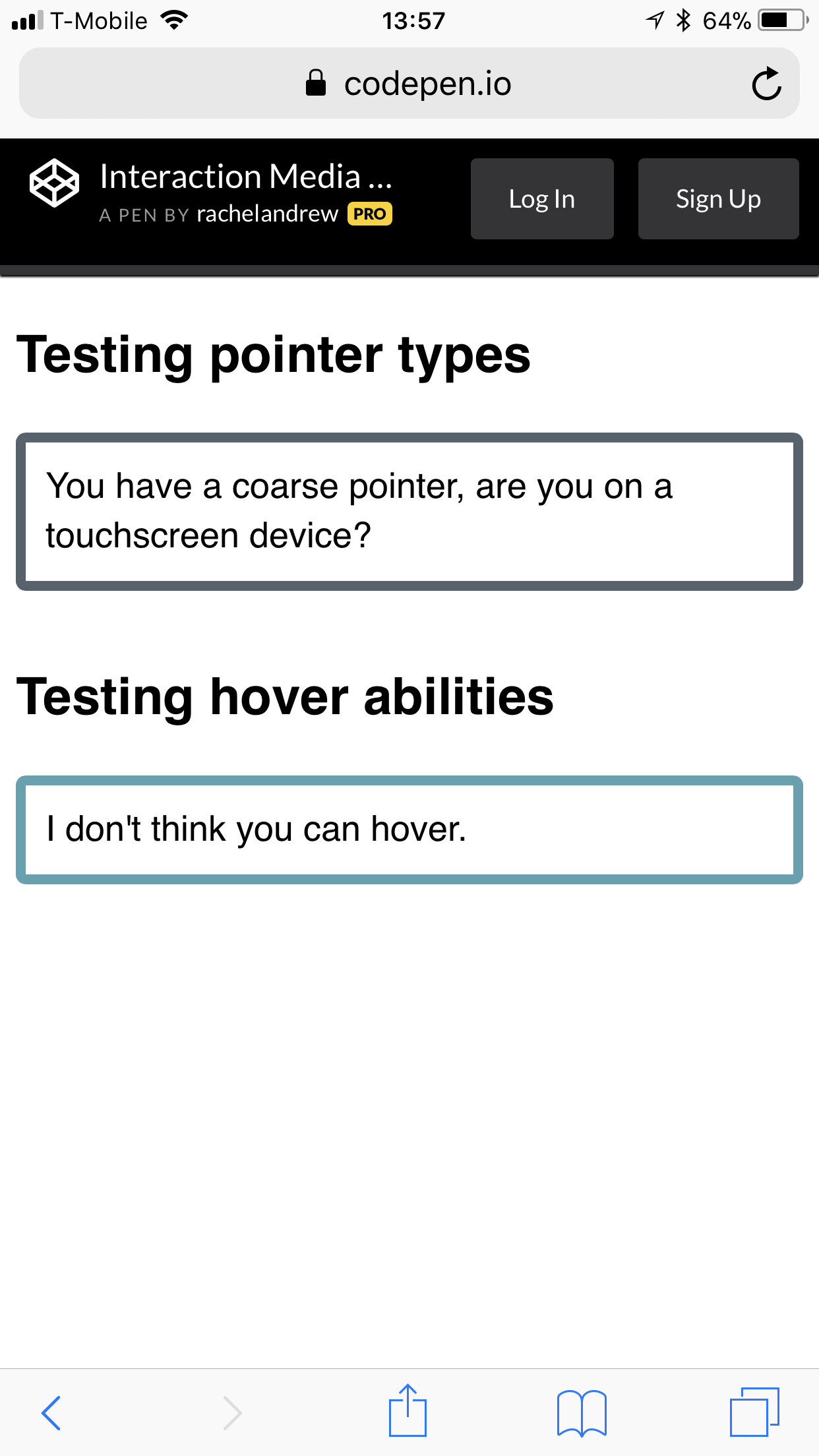
Check it out for yourself in the CodePen.
See the Pen Interaction Media Queries by Rachel Andrew (@rachelandrew) on CodePen.
There is also an any-pointer and any-hover feature, which tests the capability of any of the pointing devices a user has to hand — as opposed to the primary pointing device tested by pointer and hover. I’d suggest that you should take great care in using these, as making a user switch from their primary pointing device is likely to result in a poor user experience. The spec suggests:
“Designing a page that relies on hovering or accurate pointing only because any-hover or any-pointer indicate that at least one of the available input mechanisms has these capabilities is likely to result in a poor experience. However, authors may use this information to inform their decision about the style and functionality they wish to provide based on any additional pointing devices that are available to the user.”
Firefox is the browser lagging behind on implementing Interaction Media Features, you can follow and star the tracking bug here, so hopefully we will see them with across the board support soon.
Overflow Detection With Display Quality Media Features
As yet unimplemented is the overflow-block feature of the Display Quality Media Features with the ability to test for how the media behaves when content overflows.
When content overflows, different media has to deal with this indifferent ways. The standard way that a computer screen or a tablet will deal with this is to scroll. Some devices — such as a billboard displaying digital advertising — cannot overflow at all. We also have paged media, if you are outputting content to print.
Therefore, another useful thing to look at, when determining what device your content is being displayed on, is the overflow: block feature. For example, if you want to detect some kind of paged media you could test.
@media (overflow-block: paged) {

}
Syntax Changes
Media queries — as we have come to know them — can end up being somewhat verbose; in level 4 are some changes to syntax to help with that. For example, we often want to specify a range, such as the below Media Query which looks for a width between 40em and 59em.
@media (min-width: 40em) and (max-width: 59em) {

}
We could rewrite this as a range:
@media (40em <= width <= 59em ) {

}
What we are saying in the second example is that width needs to be greater than or equal to 40em and also less than or equal to 59em; in a much less verbose way that the prefixed with min- and max- width feature of the first example. You will still be able to use the old way of doing things; it isn’t about to be removed. However, a less verbose alternative seems to be a bonus.
Media queries are still a useful tool that we have at our disposal as we create responsive layouts. I’ve seen people jumping through hoops with Grid to try to avoid invoking one, yet there is no reason to avoid useful media queries. As I hope I’ve demonstrated, there are also new and useful features coming which will help us enhance our user interfaces for more users. To read more, here are some additional references, articles, and presentations. Some of these I used when preparing this article, others make for additional useful reading.
- “7 Habits of Highly Effective Media Queries,” Brad Frost
- “Vertical Media Queries and Wide Sites,” Trent Walton
- “Media Queries 4,” Florian Rivoal, dotCSS 2017
- “Interaction Media Features and their Potential (for incorrect assumptions),” Patrick H. Lauke, Dev.Opera
Further Reading
- CSS Blurry Shimmer Effect
- How To Draw Radar Charts In Web
- Solving Media Object Float Issues With CSS Block Formatting Contexts
- Level Up Your CSS Skills With The :has() Selector
 (il, mrn)

