Movie Poster Designs To Inspire Your PWA Hero Images

Email Newsletter
Weekly tips on front-end & UX.
Trusted by 200,000+ folks.

 Register!
 Flexible CMS. Headless & API 1st

I visited the Fandango website last weekend, hoping to find something that would give me an excuse to spend a couple of hours inside an air-conditioned movie theater. This is what first caught my eye when I got there:
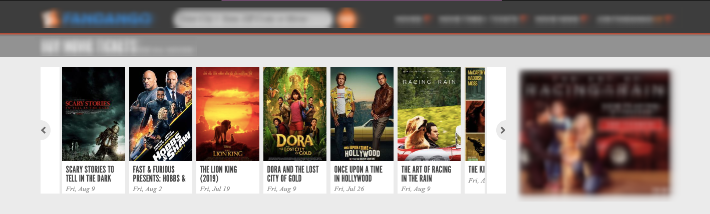
To be honest, most of these movie posters did absolutely nothing to motivate me to leave the house. Except for The Lion King, which has such a striking color palette, and Once Upon a Time in Hollywood, which does some cool stuff with typography.
Has anyone else ever experienced this before? You’re in the mood to watch a movie and either:
- Catch a glimpse of the movie poster you were interested in, only to question whether or not it’s even worth watching?
- Catch a glimpse of a movie poster you hadn’t given much thought to, but then changed your plan and saw that one instead?
And we’re not even talking about movie trailers here. We’re talking about what a single poster designed to promote a movie and entice people to watch it can do to your perception of it.
If you think about it, the hero image on a PWA has just as much sway over a first-time visitor.
“
Do your visitors proceed through the PWA with excitement over what they’re about to find? Or do they do so with apprehension due to disappointment or confusion caused by the first image?
Let’s look at some examples of good and bad movie posters and see what sort of lessons we can use to help you with your PWA hero design:
1. Avoid Stock Photos When You Can
In other parts of a PWA, high-quality stock photos purchased from sites like Getty or iStock may suffice. But your hero image?
I’d say you should be very careful with this, especially if using a stock photo that’s easily recognizable. Even if it’s an attractive photo and aligns perfectly well with the brand’s story, do you really think someone else’s imagery belongs at the top of the PWA?
When Aquaman came out in 2018, they released a series of movie posters to promote it. However, it was this particular poster that caused a huge uproar online:
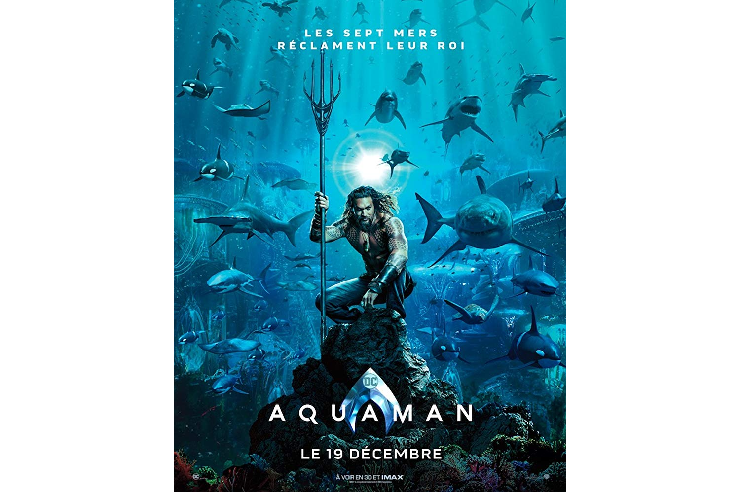
Essentially, the complaints on Twitter boiled down to the usage of this stock photo from Getty:
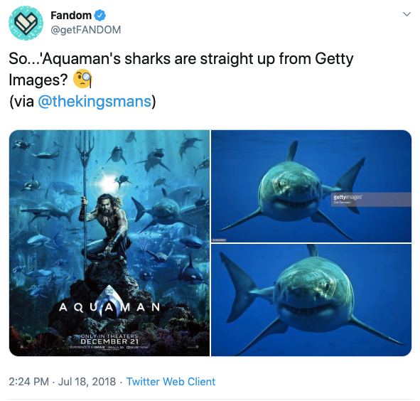
Now, you can expect there to be arguments whenever any major criticism is made of a superhero movie. With camps clearly divided between Marvel and DC movies, it’s kind of hard not to want to defend your superheroes tooth and nail when someone insults them. Even if it’s because of a stock photo of a shark.
The people against the criticism have a point though. It’s not like the real stars of the movie could be submerged in a body of water with live sharks. Aside from stock photography or CGI, what choice did the poster designers really have?
That said, I think what the real issue is, is that this is a huge movie with a huge studio budget, and the inclusion of a stock photo makes you wonder if they cut corners anywhere else in the film.
The usage of recognizable stock photos in a hero image may send the same sort of signal to visitors if they’re expecting an end-to-end premium experience from the brand behind it.
2. Make It Unique
If you watch as many movies as I do, you’re bound to notice certain trends when it comes to movie posters. This is especially so in the rom-com genre where it almost feels like designers don’t bother to be original or creative.
While this lookalike quality of movie posters can help fans of certain genres instantly identify the kinds of movies they want to watch, it sends another signal to them as well.
If you don’t know who Nicholas Sparks is, he’s the author of over twenty books, most of which have similar plots.
I’m going to let this Vanity Fair movie poster compilation demonstrate my point:
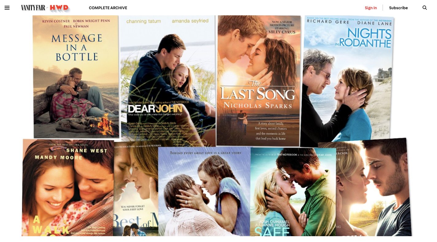
If you were to talk to someone about one of these movies, it could be summed up as:
“You know the movie… The one with the boy and the girl who don’t really like each other at first, but then they fall madly in love and can’t stand to be apart? Oh yeah and there’s that person who dies in the end.”
That describes about 80% of these stories, which is why it’s not all that surprising that the movie posters for each look so darn similar.
Like I said, a similarly designed poster could work in their favor if they were trying to appeal to a very specific subset of moviegoers. But it doesn’t work that way with PWAs.
Unless you’re building a PWA to directly complement another brand, there’s no reason to design your hero image to look similar to anyone else’s. It’ll only cause confusion when visitors pick up on the similarities. Or they’ll wonder why they’re bothering to look at the PWA, assuming that it’s not just the images that look the same, but the services and products within, too.
If you want your PWA to stand out from the crowd, your hero image should be unique.
3. Zero In On One Thing
One of the problems with making a movie with an all-star cast is that’s it’s impossible to focus on just one person — not just within the plot, but in the movie poster as well.
Case in point: What to Expect When You’re Expecting:
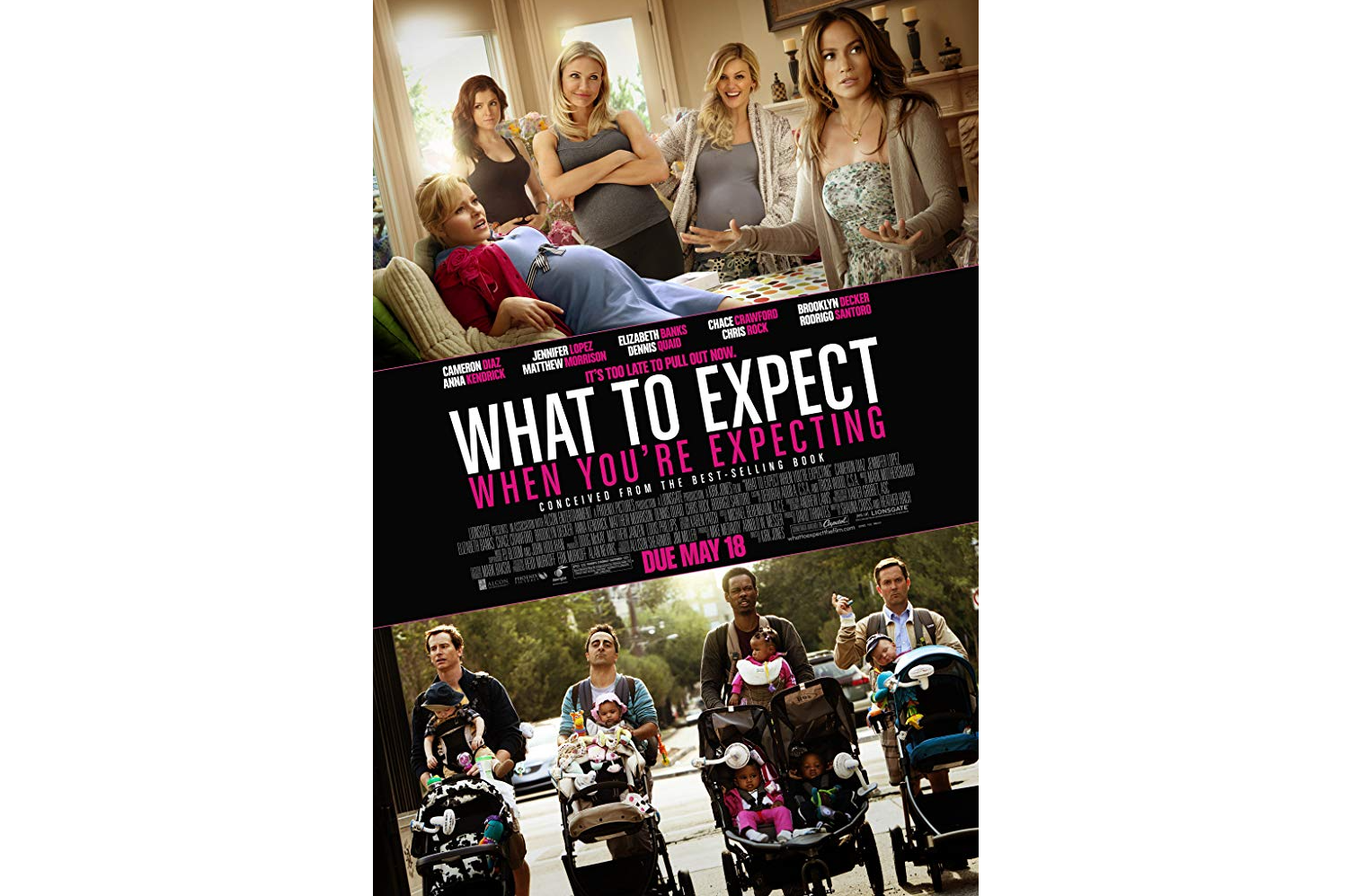
If I were just stumbling upon this poster for the first time, I wouldn’t know where to start with it.
The title being in the middle helps, but the competing photos are overwhelming. Plus, if you look closely at the top photo, you’ll see that each of the women was individually layered into the picture. Why use a poorly compiled photo beside an actual shot from the movie? It creates a very disjointed experience.
To show you what a difference a singular focus can make, let’s look at the movie poster for E.T. the Extra-Terrestrial:
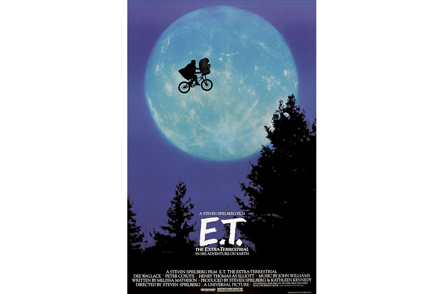
It’s not as though this film is without a great cast of stars. It’s just that the team who designed this recognized that there’s one real focus at the heart of the movie and it’s the relationship between Elliott (the boy) and E.T. (the alien).
I’d urge you to look for something similar when designing your hero image — even if your clients come to you and say that all of their services are equally important and they want the PWA to demonstrate that they can do all things for everyone. If you try to translate that sort of message into an image, it’s going to fail. So, find your focus.
4. Give The City A Subtle Nod
Movies can take place in any number of settings. Depending on what kind of movie it is, you may even find that the setting almost becomes a character within the story. Let me explain.
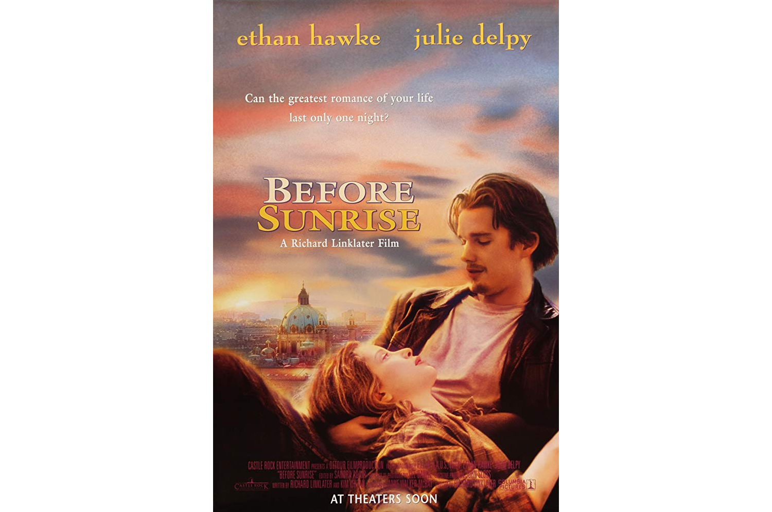
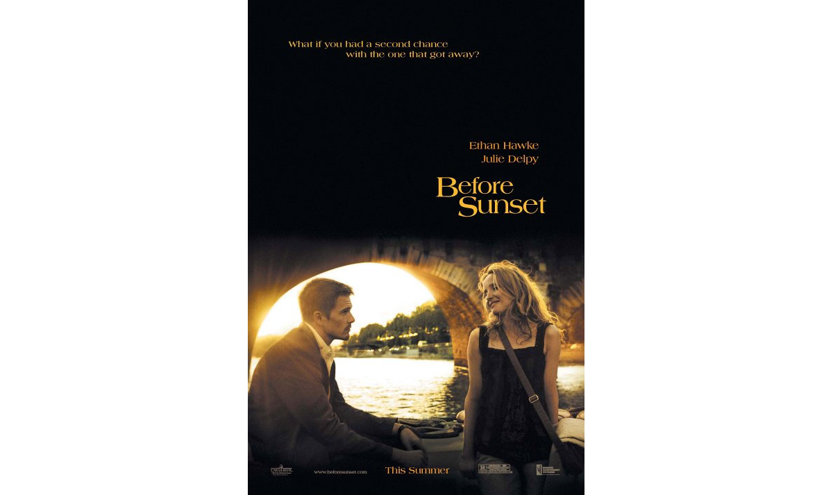
Richard Linklater filmed a trilogy of movies with Julie Delpy and Ethan Hawke.
The first movie is called Before Sunrise and takes place when Delpy and Hawke decide to get off a train and walk around the city of Vienna before parting the next morning:
The second movie is called Before Sunset and it takes place around the city of Paris:
The final movie is called Before Midnight and it takes place in Greece:
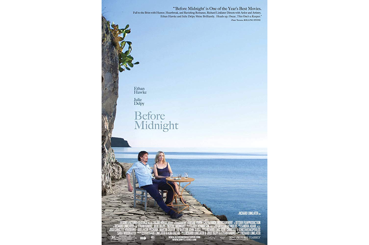
In each of these posters, you can see that the backdrop of the story plays heavily into the design. And that’s because there really is no story without their geographic surroundings.
They’re not just movies about two people talking to one another. It’s about two people getting to know one another as they explore a new city — a city which almost becomes like a third character that the viewer becomes acquainted with throughout the films.
If the company for whom you’re designing has a strong tie to a specific geographic region, see if you can find a way to incorporate it into the hero image somehow. It doesn’t have to be this explicit with the actual cityscape in the background. But there may be other ways to add a special touch that has local visitors thinking, “Hey, that’s where I’m from!” or “I’ve been there!”
5. Be Creative With White Space
You already know that white space is an important part of design, especially when you’re trying to convey a big message above-the-fold on a PWA. So as not to overwhelm visitors, you want to keep things simple. But that doesn’t mean you can’t be creative with how you fill that white space.
Take, for instance, the poster for Independence Day:
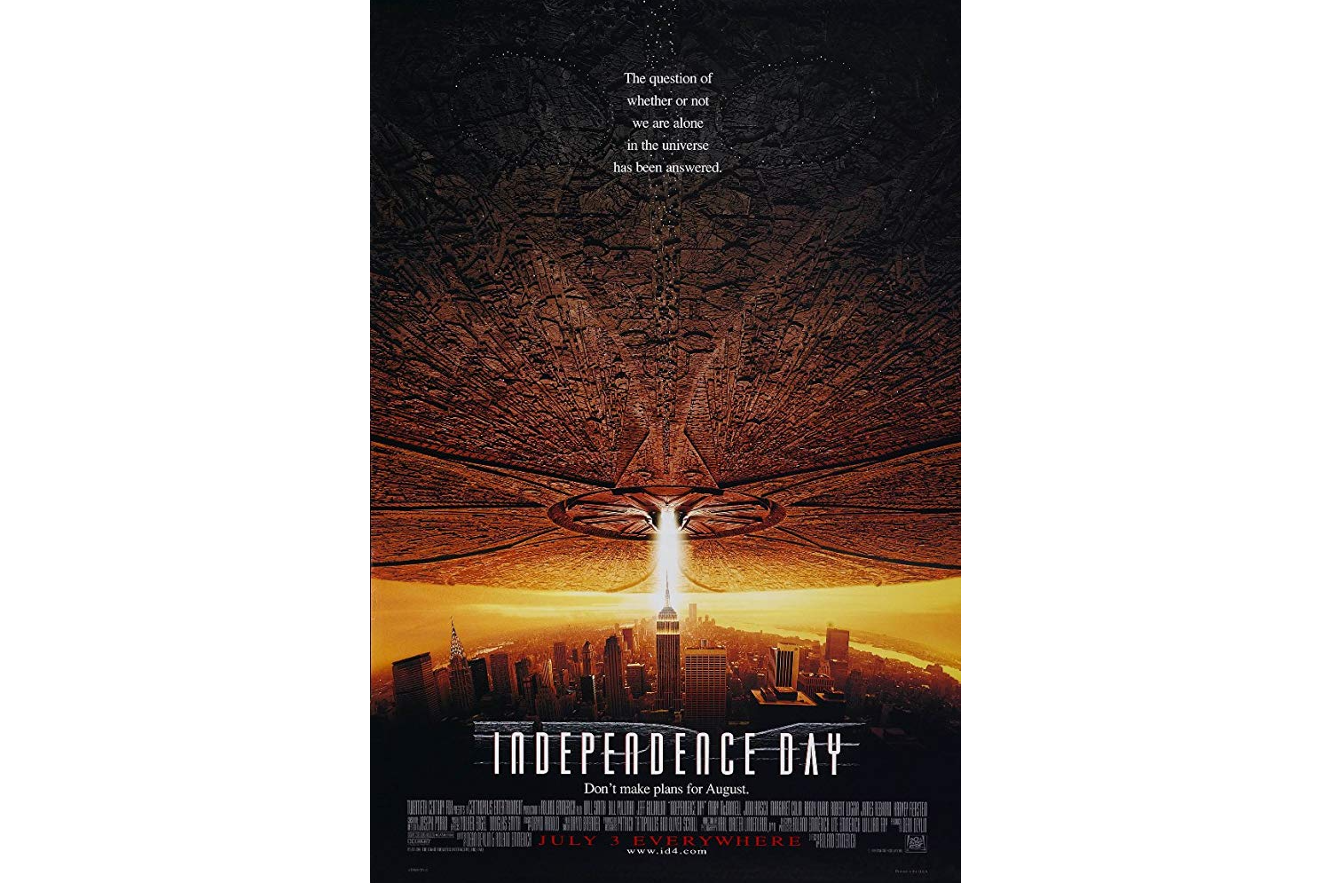
Although the space ship does convey a sense of dread, it’s also a really creative way to fill up all of the white space that would otherwise occupy the top of this photo.
Another fun example of playing with white space can be seen in the poster for Scarface:
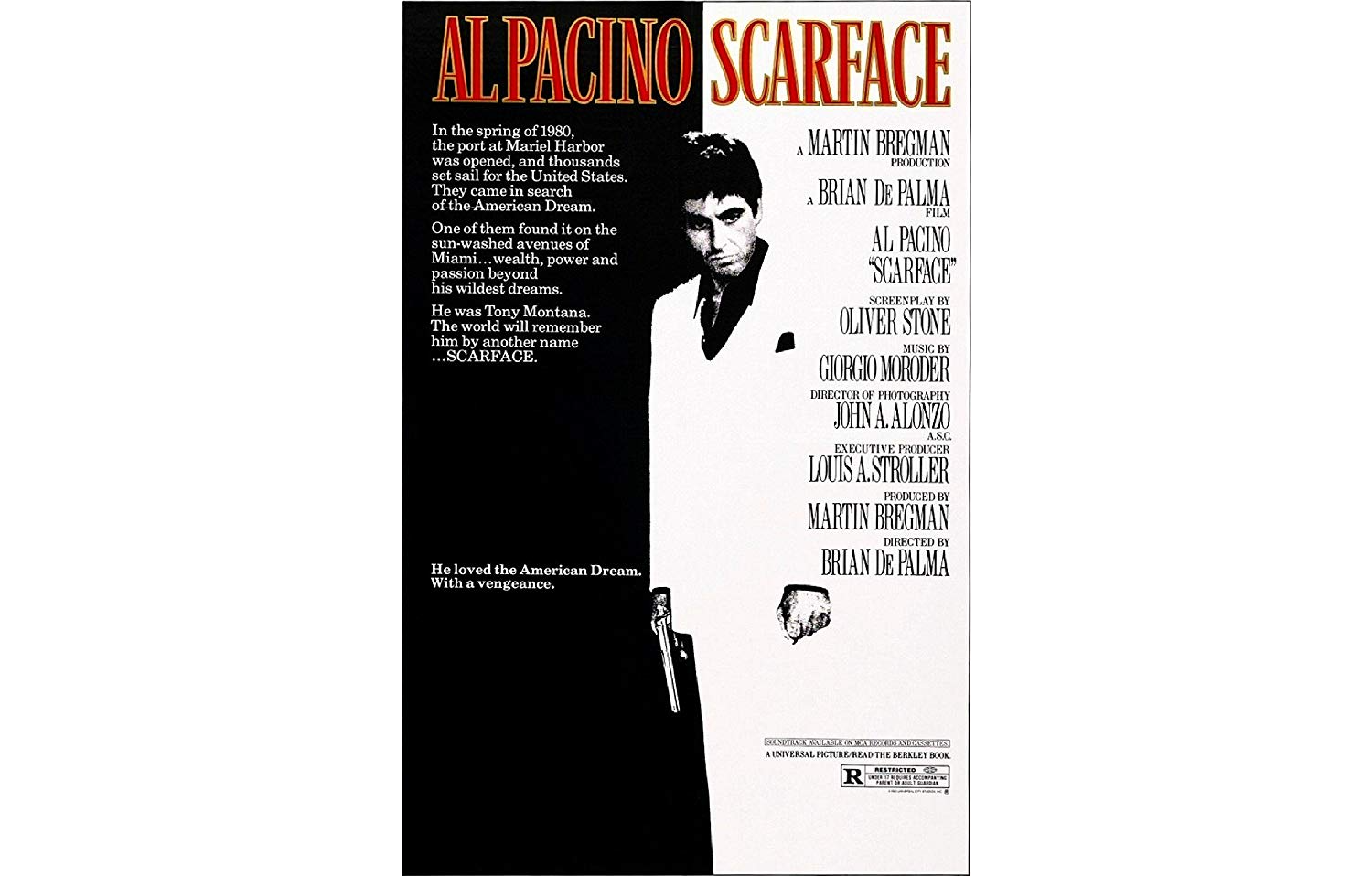
At first glance, you might just take this for the striking image that it is. However, knowing that Tony Montana is the head of a drug cartel and has an obscene penchant for snorting coke, the white that consumes him takes on another meaning here.
This one is a bit difficult to give you strict guidance on since this is all about being creative with the space that you have. What I would suggest if you want to go this route, though, is to think of ways to play with symbolism without having to explicitly present them within the photo. If you can play with shadows and light and space to do so, that would have a much greater impact.
6. Be Playful With Typography
For the most part, designers of movie posters tend to be very conservative when it comes to typography. They choose a single color for the font and it’s almost always a big blocky sans serif font.
But why not have a little fun with it? Just as you can imbue the image with creative flourishes, it wouldn’t be such a bad idea to do the same with text so long as the two complement one another.
You’ll find a beautiful example of this in the John Wick poster:
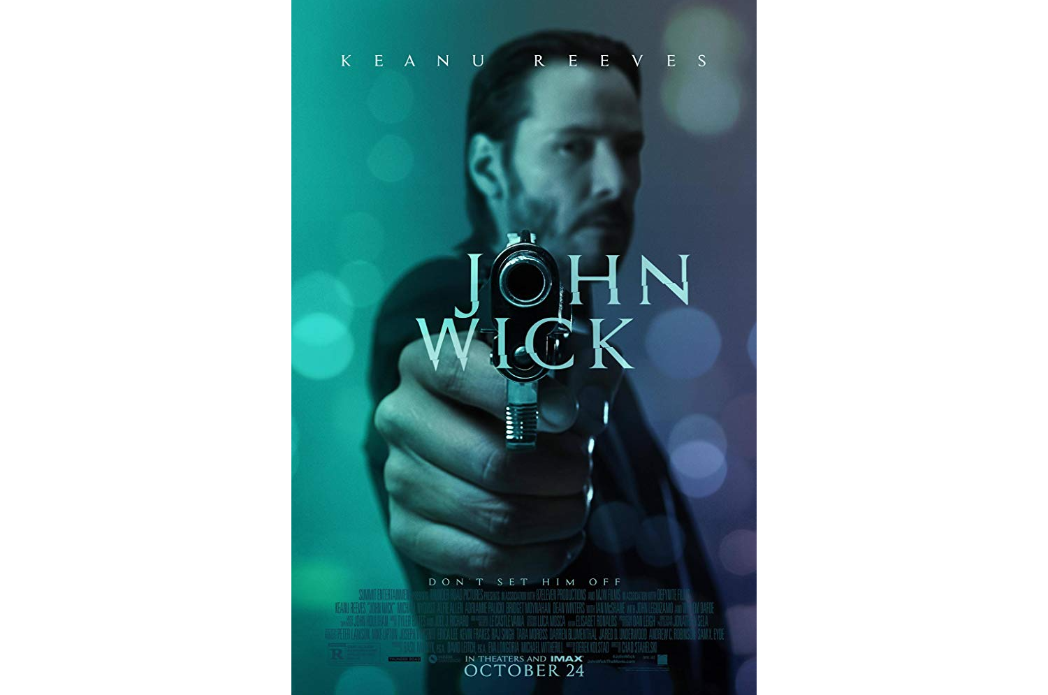
If you were to quickly glance at the image, you might not pick up on the subtleties of the design. But they’re there.
For starters, the barrel of the gun takes the place of the letter “o”. But notice how the rim is tinged in the same color as the rest of the letters? This is what helps it blend so well at first glance.
Then, you have the unhinged look of the letters themselves, where they’re split and slanted through the middle.
For those of you who haven’t seen the film, this is essentially what’s happening to Keanu Reeves’s character. He was once an assassin, but gave it up for love. When his wife dies and the last remnants of her are taken from him, he’s torn. Does he continue the life of a normal man? Or does he give it all up and go on a murderous rampage?
I know that the smart thing to do when designing a hero image is to let the image tell the story, but I think subtle touches to the text can really take it up a notch.
Wrapping Up
So, what have we learned here? Well, there’s certainly a right and wrong way to go about designing a movie poster and PWA. But, more than that, the most important thing to do is to put some real thought into what you want those first few seconds to convey to your viewers.
If you fail to capture what the PWA is about or you do so in a manner that’s boring, unoriginal, vague or cheesy, you’re going to lose their interest almost immediately.
But…
If you can perfectly capture what a brand is all about along with the subtle nuances that make it special, you’ll encourage more visitors to scroll and click with a single image.
Recommended Reading on SmashingMag:
- An Extensive Guide To Progressive Web Applications
- Will PWAs Replace Native Mobile Apps?
- Can You Make More Money With A Mobile App Or A PWA?
- Native And PWA: Choices, Not Challengers!


