How To Use FOMO To Increase Conversions

Email Newsletter
Weekly tips on front-end & UX.
Trusted by 200,000+ folks.

 Flexible CMS. Headless & API 1st

 Register!
Consumers are motivated by need and desire. And sometimes, just sometimes, they’re motivated by FOMO. That’s right: we can now add the ‘Fear Of Missing Out’ to the list of drivers that get consumers onto our websites and into our apps.
With that said, when we take a closer look at what FOMO really means and the negative impact it can have on consumers, is it something we really want to be encouraging as we build digital experiences for them? My answer to that is:
Yes, but you must use FOMO responsibly.
FOMO can be a really effective tool to add to a marketing and sales strategy. As a web designer, though, you need to find ethical ways to appeal to your users’ fear of missing out. Today, I’m going to show you some options for doing this.
A More Ethical Way To Design with FOMO
FOMO stands for “fear of missing out”, and while it might seem like some innocuous acronym like YOLO or LMAO, this isn’t a cute way of saying “Wish I were there!”.
The fear part of FOMO is all too real.
A 2013 study titled “Motivational, emotional, and behavioral correlates of fear of missing out” defined FOMO as:
A pervasive apprehension that others might be having rewarding experiences from which one is absent, FoMO is characterized by the desire to stay continually connected with what others are doing.
One of the conclusions from the report was that “FoMO was associated with lower need satisfaction, mood, and life satisfaction.”
It’s not just scientists taking note of the negative effects of FOMO in marketing, social media or otherwise. The Competition and Markets Authority went after hotel booking sites for using misleadingly urgent and deceptive discount marketing messages to increase sales.
Even without the fear of retribution from some standards authority, you really need to think about how your web and mobile apps leave your users feeling. A little bit of envy might be fine, but once the general sentiment trickles over to jealousy, disappointment or stress, it’s time to reassess what you’re doing and why.
Let’s take a look at some ways you can leverage the underlying concept of “missing out” and strip away the fear elements.
Quick note: All of the examples below are from mobile apps, however, you can use these design principles on websites and PWAs as well.
Gently Remind Visitors About Limited Availability
There’s nothing wrong with presenting limits to your users on what’s available or for how long it will remain available. It only becomes a problem when how you convey this sense of urgency or limitation causes stressful decision-making.
This is something I talked about in a recent post, “How to Stop Analysis Paralysis with Web Design”.
Basically, when you induce stress in your visitors or consumers, it makes the decision-making process more difficult and can lead to regretful purchases or no purchases at all. In that last article, the focus was on the drawbacks of presenting customers with too many choices.
However, the same kind of response (i.e. dissatisfaction and overwhelm) can happen when you put pressure on them to make a choice on the spot.
So, instead of displaying a large timer counting down the minutes left to buy items in their shopping cart or a bright red banner that screams “24-Hour Sale!”, use more gentle reminders around the site or app.
Best Buy has an entire section on its product pages dedicated to in-store and online availability:
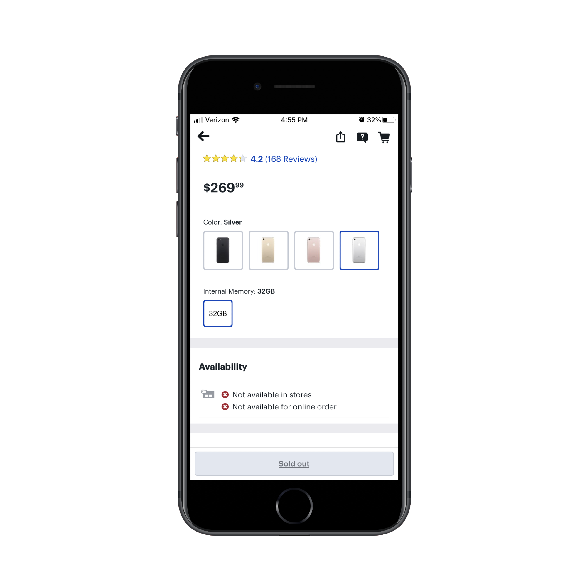
Now, if this were a product with only one color or memory option, I’d suggest removing it from the online inventory altogether. If you can’t provide a date when the product will become available again or put customers on a waitlist, don’t bother teasing them with an out-of-stock listing.
That said, this item has multiple variations, which makes the “sold out” notice quite potent.
Paul Messinger, a professor of business and researcher at the University of Alberta, commented on this phenomenon:
Sold-out products create a sense of immediacy for customers; they feel that if one product is gone, the next item could also sell out. Our research shows there's also an information cascade, where people infer that if a product is sold out, it must have been good and therefore a similar available product will also be desirable.
What’s also nice about displaying sold-out products is that it reduces the number of choices consumers have to make. Granted, some may be unhappy because the silver phone they wanted is unavailable, but, as Messinger says, this limitation on what they can buy might encourage them to try another variation of the product.
One of my absolute favorite examples of gently nudging consumers to use or buy your products is Hulu:
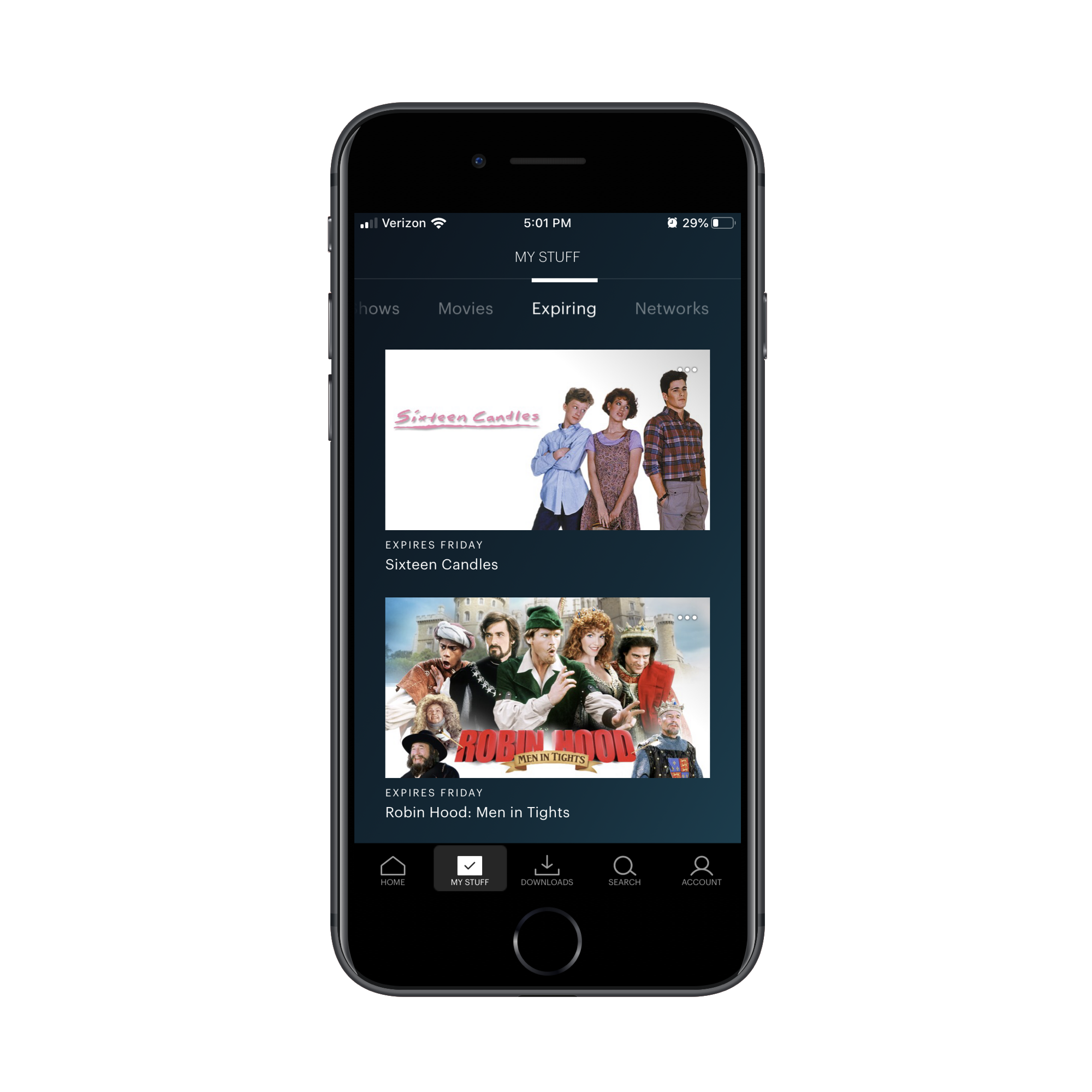
There is an entire tab in the app that lets users know which content is about to expire.
For those of you who stream content like a maniac (like myself), you know how easy it is to lose track of shows and movies you’ve added to your list. You also know how hard it can be to find the perfect thing to watch when you have dozens of options sitting in your queue, especially if you use more than one streaming service.
That’s why this “Expiring” tab is brilliant. The second I see it, I think, “Either use it or lose it, Suzanne” — which is incredibly motivating. Also, the fact that I have a much shorter list to work with helps me get to a decision more quickly.
This would be useful for e-commerce websites, for sure. If you have products that are low in inventory, give them a dedicated space for shoppers to peruse — kind of like a bargain bin without the bargain.
If your website runs a number of offers simultaneously, you could use a similar approach as well. Create a page for “Offers” or “Rewards” and break out a separate tab that shows users all the offers that are about to expire.
Call Attention to Rewards
When selling something online — be it a subscription to a repository of plugins or a store full of products — don’t forget to enable account registration. Sure, it’s a nice touch for users that want the convenience of saving account details so they don’t have to input them with each new purchase. There’s another reason to encourage your users to register though:
So you have a way to call attention to their spendable rewards.
FOMO isn’t always the fear of missing out on what others are doing. Sometimes it’s just a fear of missing the chance to get a really good deal. Promoting attractive sales offers (“75% off everything in store!”) is one way to do that, but, again, you have to recognize that that’s only going to stir up issues caused by the paradox of choice.
A softer but still effective way to compel users to buy sooner rather than later is to show off their rewards totals or expiration dates.
As a Gap customer, this is one of my favorite things about shopping with them. Whether I’m in store, on the app, shopping through the website or looking through my email, I receive these kinds of reminders:
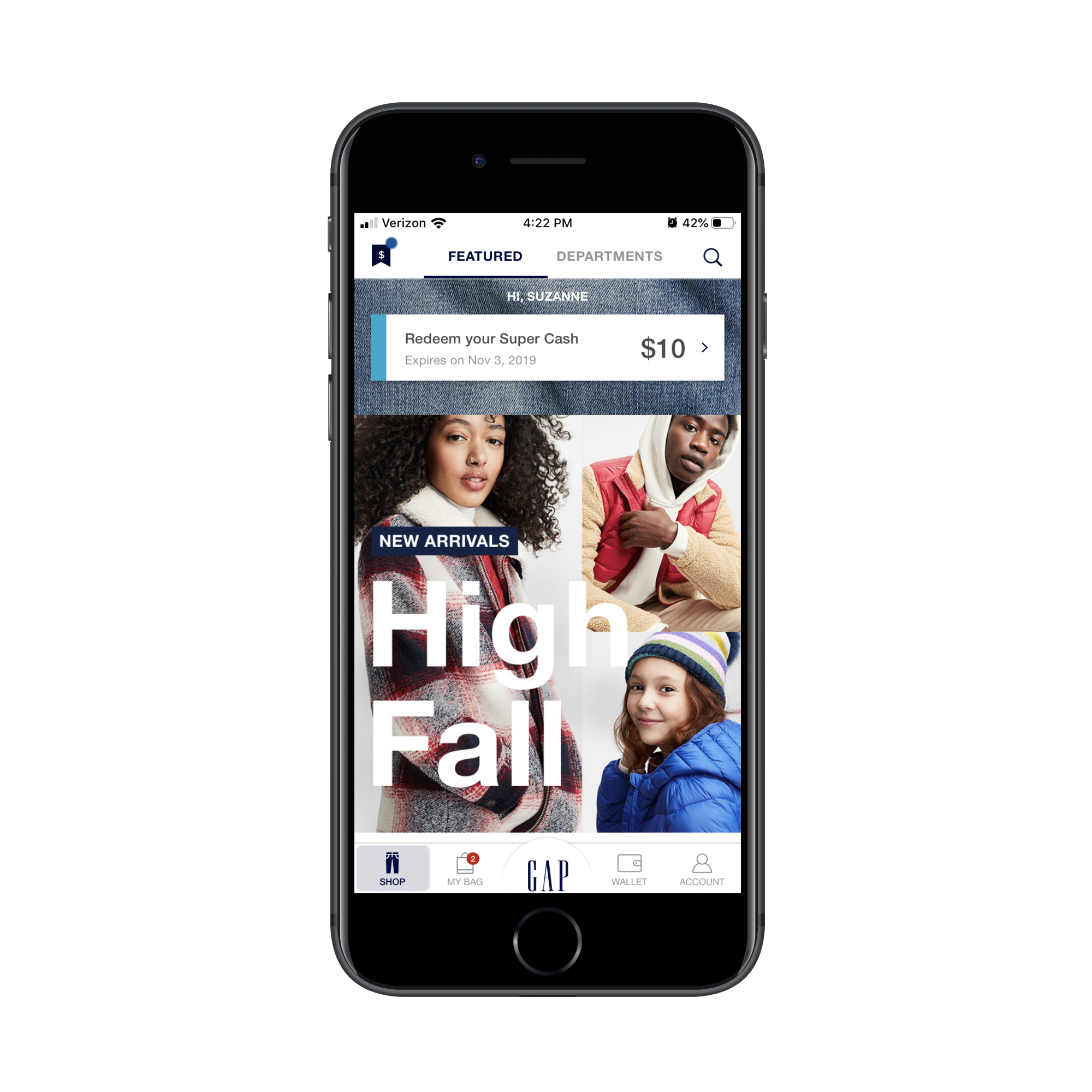
The “Redeem your Super Cash” reminder is the first thing I see when I log in. Even if I’ve gone to the app with the intention of just window browsing, that rewards reminder (and the impending expiration) almost always motivates me to buy something so I don’t lose my member perks.
Unlike sales banners that promote generic offers, this approach works really well because you’re appealing to loyal customers — the ones who’ve already signed up for an account and have a history of buying from you.
And if you’re worried about a banner of that size taking up too much space in your app or mobile website, think again:

Gap doesn’t continually show the rewards reminder.
See the icon in the top left corner with the circle over it? That circle is pulsing. It’s there to let customers know that there’s something to look at before they check out. And that something are the rewards they need to spend before they lose them.
Hotels.com, on the other hand, dedicates an entire page to rewards:

It’s similar to that urge people feel to log into social media just to check on what’s going on and to make sure they’re not missing anything. This “Rewards” tab should send a similar vibe: “Hmmm… I wonder how close I am to my free night?”
Although you can’t see it here, Hotels.com has a policy about how long customers can hold onto these earned nights before they lose them. (It’s just below this section.) By gently reminding users about this stipulation, it likely encourages its rewards members to book more trips so they can get their free night.
Encourage Sharing with Friends and Family
One of the problems with building FOMO into a website — much like any marketing you do for business — is that it’s coming from you. Until you’ve earned the trust of visitors and users, how are they supposed to believe a product marked as a “Top Seller” really is what you claim it to be? Social proof is supposed to help mitigate these kinds of concerns, but even that can be faked.
You know what I think is a more effective way to generate FOMO? Let your customers and clients do it for you.
Here’s how Airbnb does it:
The “Invite friends” feature encourages users to let their friends, family and colleagues know about how awesome the Airbnb experience is.
Hey, I just booked this awesome apartment in Montreal for Christmas. You’ve got to check this out! Oh yeah, you also get $40 off your first booking!
Even the headline on the landing page encourages them to share the experience; not just do it to get free travel credit (though that’s a nice incentive, too):
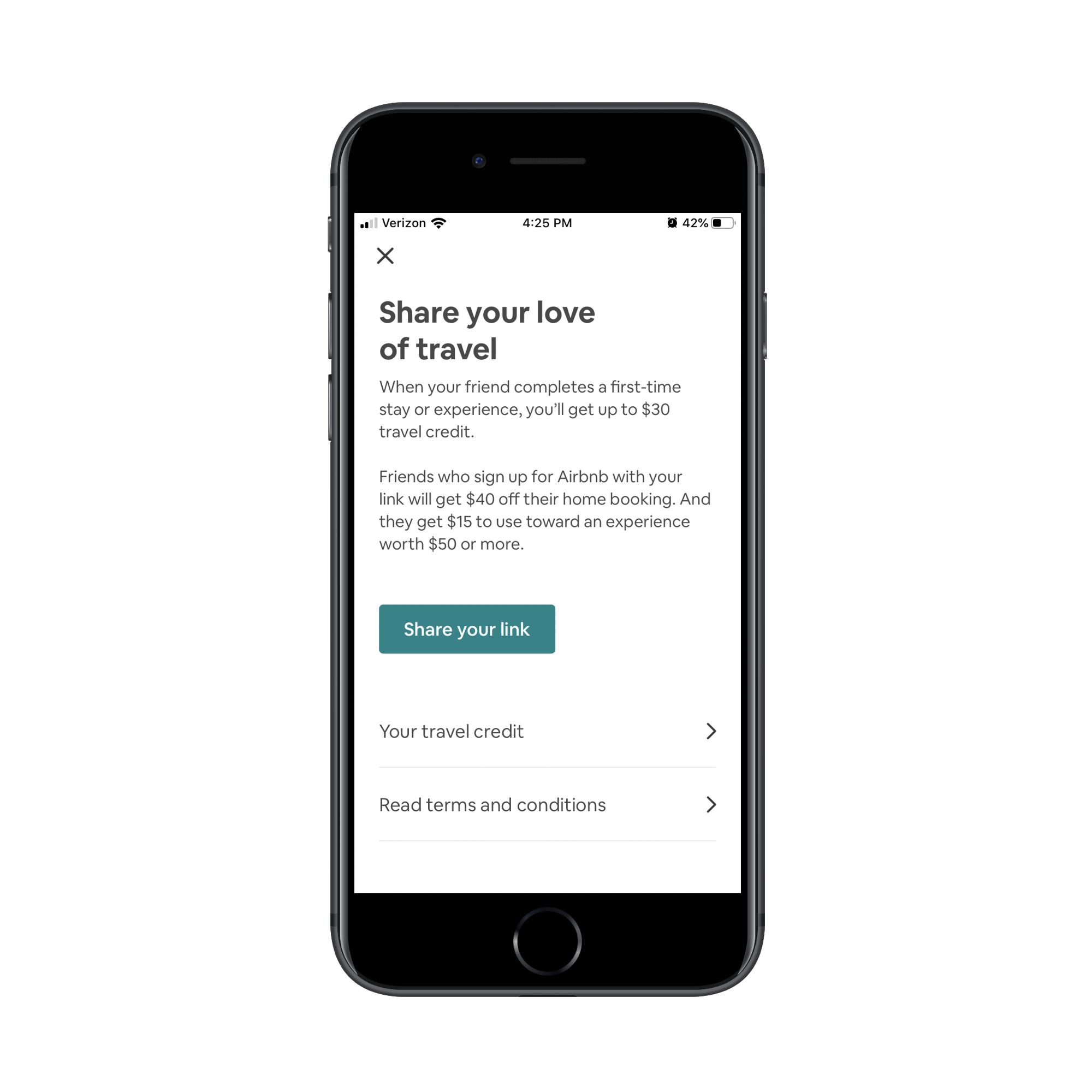
Imagine that friend who’s busy running a business and in dire need of a vacation. They receive this offer from you — a person they know and trust. Of course, their reaction is going to be, “I need to do that, too!” And with a discount code in hand, that’s a pretty strong source of motivation to get in the app and make a purchase.
You’ll find another great example of generating FOMO through your users from the 23andMe website:
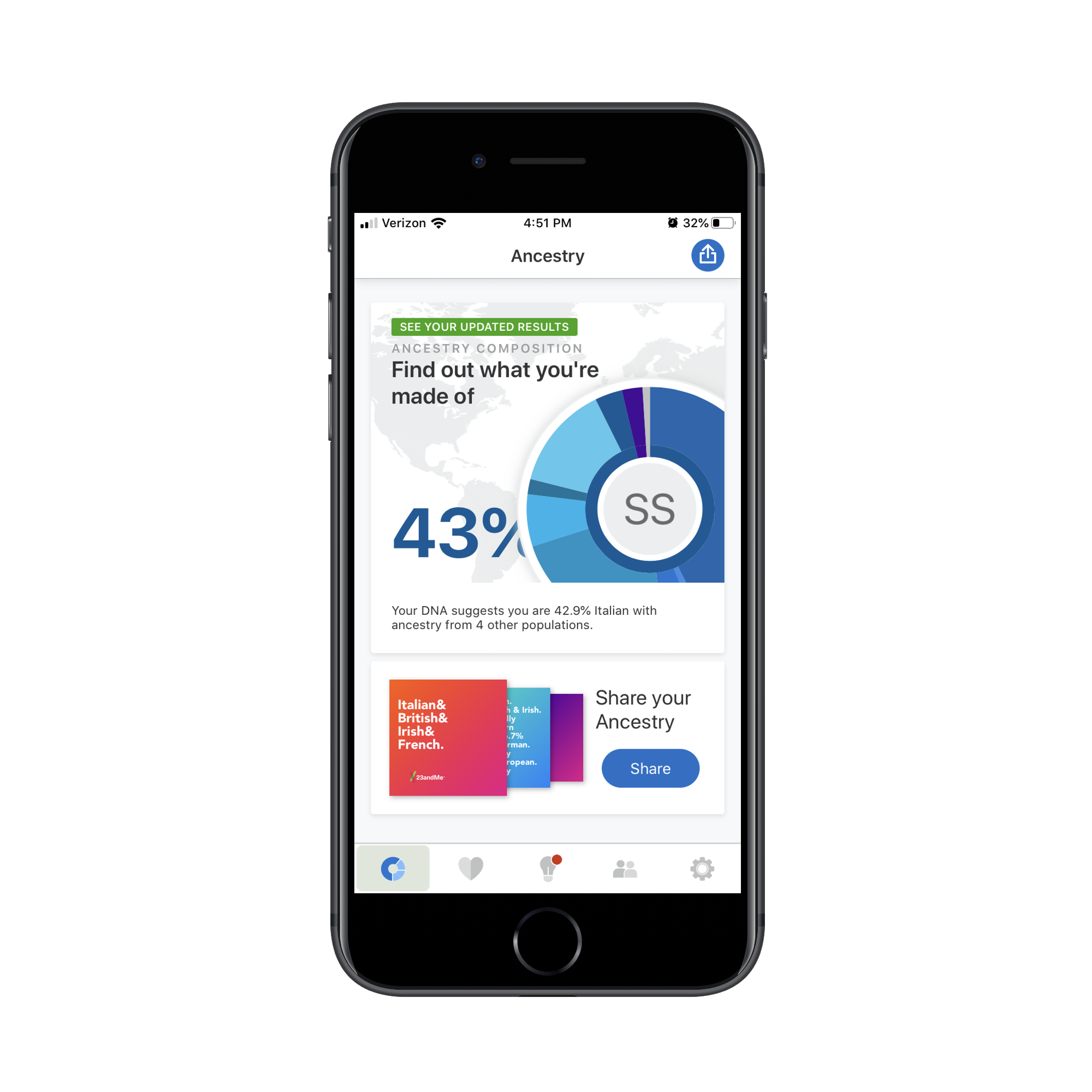
For those of you who haven’t signed up for one of these genetic testing services, it’s actually pretty cool. You submit a saliva sample and they tell you what your ancestral background is (as well as how it can affect your health). But it’s more than just, “Your maternal family originates from Turkey.” It gets super-specific on what parts of the world your ancestors are from.
Notice that banner in the screenshot above that says “Share your Ancestry”? That’s where users find auto-generated social posts that are designed to be share-worthy (they look like Facebook and Instagram Story cards):
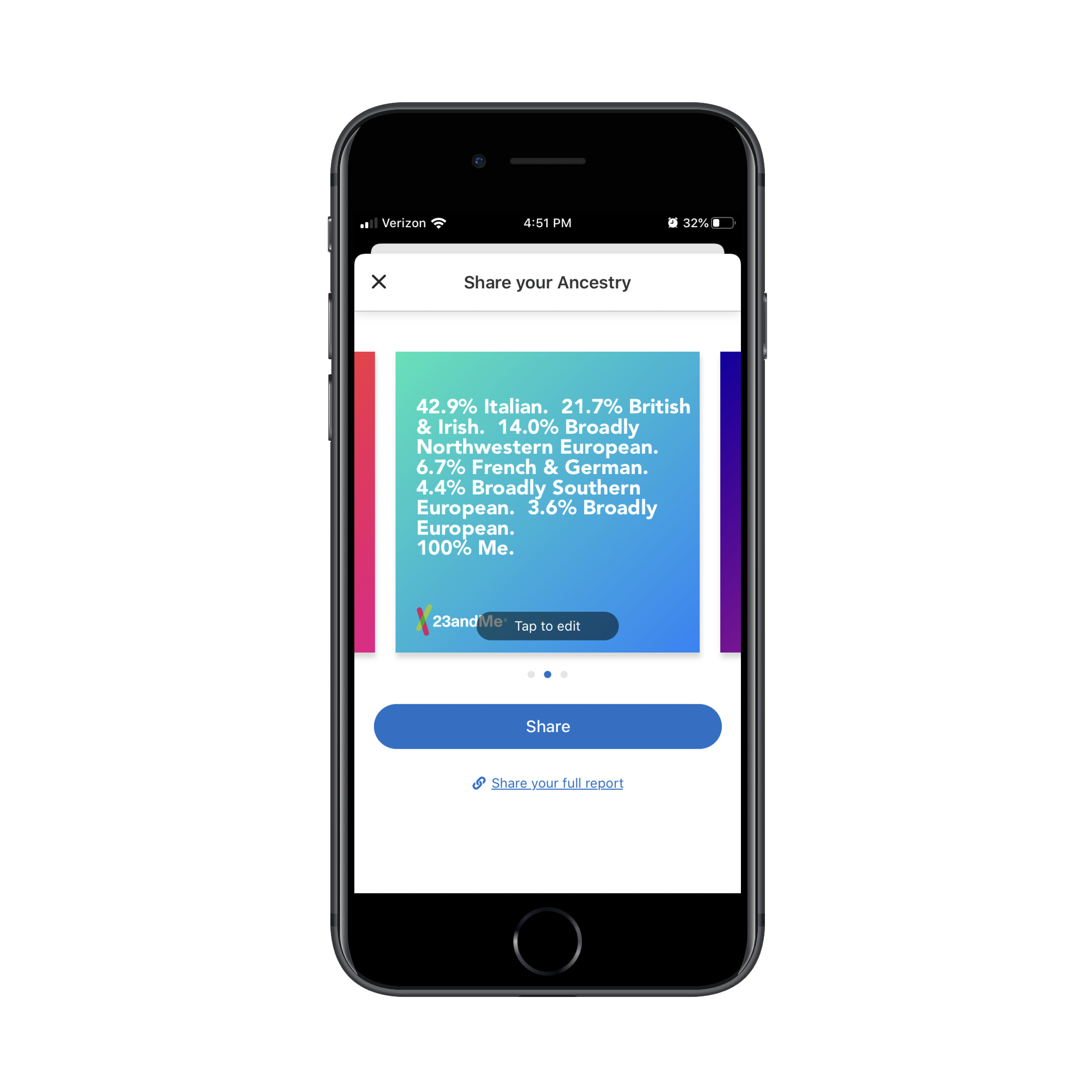
This is my ancestral breakdown according to 23andMe. So, let’s say I want to joke about how boringly anti-nomadic my ancestors were on Twitter. I could edit the banner or share it as is. And guess what? That’s free advertising for 23andMe, even if I chose to ditch the logo they placed at the bottom of the file.
As those posts reach social media connections — those that know the user or those that are only acquainted with them online — FOMO starts to rear its head. “Oooh! I really want one of these! Where’d you find this out?”
With this kind of FOMO marketing on your site or app, you can stop relying so much on heavily-discounted sales events and other urgency-inducing tactics (which will cost you more in the long run). Instead, let your users generate that intensified interest.
Use More Grounded Photos and Designs
You’ve no doubt heard about lifestyle influencers using shady promotional tactics to increase sales.
One of the most well-known examples of this is the Fyre Festival, which created a bunch of buzz on social media thanks to promotional videos of celebrities and supermodels partying it up in the Caribbean. The people behind this failed festival didn’t care about the experience. They focused solely on the image of it and consumers ate it up with a spoon — until they realized that image was a lie once they got there.
Then, you have micro-influencers who try to make money from affiliate sales. However, all is usually not what it seems as Jordan Bunker explained to The Guardian:
All isn’t how it is perceived on Instagram. People assume I have a great life and everything is handed to me. I live with my parents and I work from a desk in my room; it’s not like I have a separate working space or office.
That’s not the only deception. Influencers often make their luxurious lives seem like something that’s easy to achieve. The reality, however, is that many of them have to work really hard to stage their life, every second of every day, hoping to get the perfect shot that will make consumers want to follow them or buy the stuff they promote.
But as Lucie Greene, an analyst who specializes in consumer behavior, pointed out:
We’re seeing a rising awareness of how social media use and influencer culture affects mental health, from Fomo (Fear of Missing Out) to driving compulsive, addictive consumption, to feelings of isolation.
Granted, the messages alone that influencers send to followers are often problematic. But so, too, are the images. So, as you design your website and integrate photos from your clients or from stock photo sites, think about what message you’re really sending.
Sephora, for instance, promotes its products with photos of the actual products. You might see a model or two on the top of the home page. For the most part, though, the focus is on the products.
That said, cosmetics and other beauty products can be used to convey a certain image and lifestyle — one that consumers desperately want. So, is Sephora missing out on an opportunity to create a “Sephora Lifestyle” by not photographing models using its products?
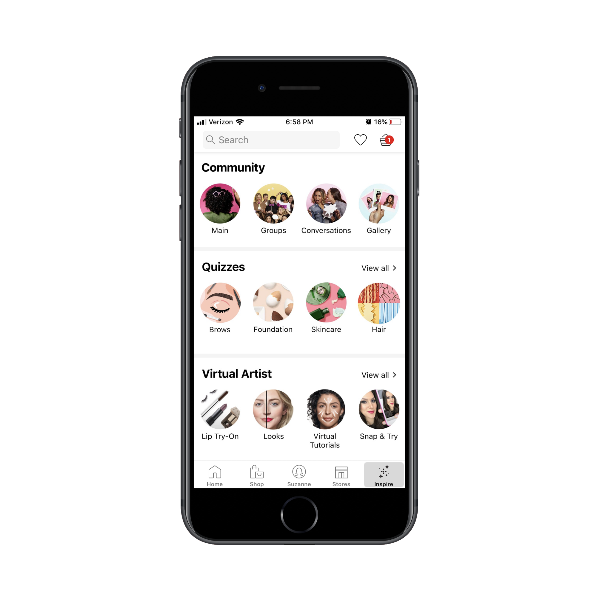
Unlike many other retailers who might share photos of models living their lives in some far-off, exotic locale while wearing their products, Sephora doesn’t do that. The only time you really see photos of its cosmetics and products in action is here, in its “Inspire” community.
So, rather than leave its customers pining for some life that they may unconsciously associate with the red lipstick they were thinking of picking up, real customers get the chance to paint a more realistic portrait of its products.
As consumers grow weary of artificially enhanced photos and scenarios, you’re going to find it harder to make them feel like they’re missing out. However, by allowing your customers to provide a real look at what your products can do (and this goes for any kind of product, physical or digital), that’s where you’ll start to see consumers responding to feelings of missing out.
Before I wrap up here, I want to point out that this isn’t just for companies that sell affordable products.
The Inner Circle, for example, is an exclusive dating app. In order to join, users must first be prescreened and approved.
Now, you might think that a luxury brand like that would want to use influencer-like photos to show users how much they’re missing out by not dating in their “class”. But they don’t.
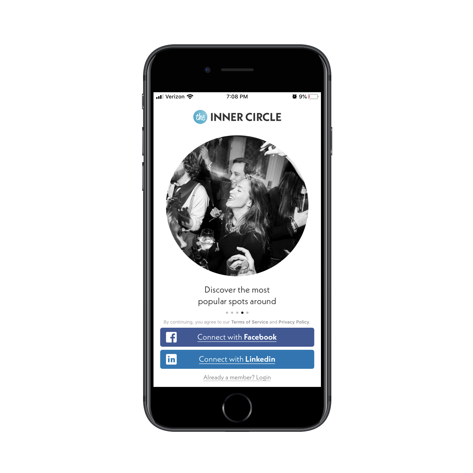
In this first example from the app’s signup page, you can see that the focus is on finding a popular spot to hang out and meet people. While the black-and-white filter does give it a swankier vibe, there’s nothing about the people in the photo that necessarily screams “Exclusive!”
The same thing goes for this photo:

This is the kind of date most people would go on: a date in the park. The people in the photo aren’t all glammed up or wearing clothes made by high-end luxury designers.
These photos feel accessible. They let users know that, at the end of the day, they’re using this app to make real-life connections. There’s nothing exclusive about that.
And if a luxury brand like The Inner Circle can send that kind of message to its users with photos, then any brand should be able to do the same and be successful with it. Just be honest in what you’re portraying, whether it’s a photo of someone cooking with your products or a look inside the real (not illustrated) dashboard of your SaaS.
If you want to give prospects the feeling that they’re about to miss out on something worthwhile, just be real with them.
Wrapping Up
Maybe not today and maybe not tomorrow, but deceptive FOMO tactics will eventually catch up with you when customers start to realize they were misled by inflated numbers, exaggerated scenarios or seemingly time-sensitive or exclusive offers.
Remember: the websites and apps you build for clients shouldn’t just attract and convert customers. They also need to help your clients retain that business and loyalty over the long term. By being more responsible with the messages you’re sending, you can help them accomplish that.


